Combine Images: How To Merge Photos Together?
So, you’re trying to be creative and trying to combine images, but not sure where to start. Fret not, because in this tutorial, we’ll show you how to merge your photos together.
How do you combine images using the Cut Paste Photos Pro App? Under MORE TOOLS, tap on the “Make a Collage” button to start merging photos together. You can select 2-10 images to combine, choose a layout and even add text or filters to it!
What is the step-by-step process on how to do it right? Let us show you.
Combine Images with Cut Paste Photos Pro App
Combine images quickly and easily with our Cut Paste Photos Pro App “Collage Maker.” Merge your most intense and most memorable pictures in one. View your memories and share them with your loved ones with just one click.
Step 1: Select 2-10 images.
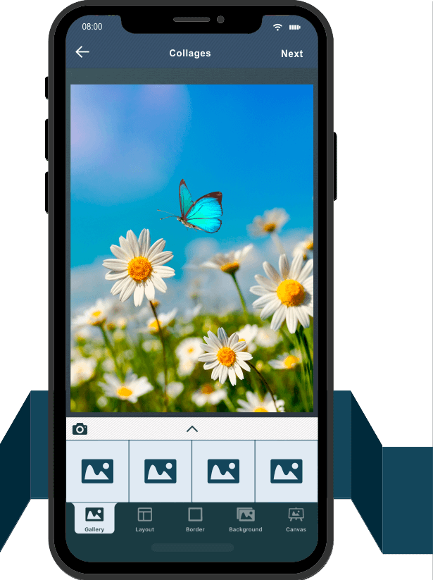
Tap “Make Collage” under the MORE TOOLS corner on Cut Paste Photos Editor. Select two to 10 images from your Camera Roll to add to your collage. Tap on NEXT.
Step 2: Choose your layout.
Once you’ve selected the images you want to merge, pick your preferred layout from the choices under your canvas. Rearrange your images until you’re satisfied with the final layout. After that, select the border tool.


Step 3: Adjust the borders.
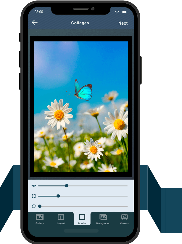
There are three ways to edit the border of your collage:
- Move the slider to the right to create a wider space between the images.
- Adjust the frame or main border size with the second slider.
- Edit the corners of your images using the final slider.
You can smooth out the corners to a curve by moving the slider to the right. Once you’re done with the borders, tap NEXT.
Step 4: Pick a canvas size.
In this step, you can adjust the size or image proportion of your collage. Choose from our preset social media sizes, the original picture size, or any of the available selections. Once you’ve picked your canvas size, tap on NEXT to further edit the collage.


Step 5: Edit as you combine images.
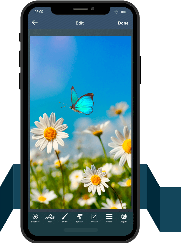
With our photo editor, you can also personalize your collage the way you want it. You can use the following tools:
- Stickers, personalize texts and scribbles
- Splash color and photo resize by pixel
- Filter and effects
- Adjustment option and tone curve
- Flip, rotate, crop, and blur
Once you’re happy with your final product, tap on Done.
Step 6: Save and share your photo collage.
Let the whole world admire your stunning collage. You can save it on your phone or share it right away on your social media.


Image Formatting Problems and How to Fix Them
It’s true that a picture paints a thousand words, but it can also cost you a lot of bucks if you don’t use the right format. Here are some image formatting mistakes and how to fix them.
Problem 1: You uploaded photos without optimizing them and now your website is slow.
Solution: Optimize your image to medium.
The size of your image size has a big impact on your website’s performance more than you thought. Just to make it clear, we’re talking about file size in megabytes (MB), kilobytes (kb), etc. — not the actual dimensions of the image (such as 800 x 600 pixels).
If your file sizes are too big, your website will start to slow down as the pages take a longer time to load. That meant losing visitors who don’t have the patience to wait.
On the other hand, if your image size is too small, you compromise the visual quality of your images. So try to find the balance between the actual dimension and the quality or resolution of the photo to determine its overall file size.
Problem 2: The focal point of your photo is not noticeable.
Solution: Crop wisely.
Cropping your images is a necessary step in the formatting process, especially for photographs. Of course, you’re not cropping out the important parts, but you must remove some parts to improve the focus or mood of the image.
On the other hand, be careful not to crop in so close that it distorts your photo. But if you have to do it, make sure to start with a fairly high-resolution photo.
Problem 3: Your combined image is constructed poorly.
Solution: Frame your image to create maximum impact.
Just like cropping, you should do framing when taking a photograph or creating an image. It has a lot to do with the traditional rules of composition as follows:
- achieve balance and focus with the “Rule of Thirds”
- arrange items in groups of three
- highlight elements such as lines and patterns to create repetition
- take advantage of positive and negative space
- include leading lines to direct the viewer’s attention to the focal point

Problem 4: The combined image you uploaded looks distorted.
Solution: Scale proportionally.
One reason why images look distorted on websites is that they’ve been stretched out of proportion to fill a certain space. To avoid this, keep the original proportions of the image when adjusting it up or down, rather than stretching the length or width to fit.
There are platforms that automatically scale your uploaded photos to fit their own requirements. So if you’re posting images to those platforms other than your own, be sure to check out the recommended upload size and format for your image.
Problem 5: You saved your combined image in the wrong file format.
Solution: Learn the differences between file types.
Not all file formats are created equal. Each file format has its specific uses, with its own set of pros and cons. Here’s a quick overview here of these file types:
- JPG (or JPEG): Pro– Used primarily for photos or highly detailed/colorful illustrations and graphics; Con-Not suitable for images with text
- PNG: Pros– Known to have high image quality and good color representation; supports transparency/opacity; produces sharp lines and edges
- GIF: Pro– This is the only file type that supports animation; perfect for simple graphics; Con– color capacity is not as good as JPGs
- SVG: Pros– resolution and zoom independent, meaning, it will remain sharp and vivid no matter what device you view it on, how high-resolution the screen is, or how much you zoom in.
- PDF: Pros- retains the original content and appearance of a file no matter where or how it is viewed; perfect for displaying whole documents online like a pamphlet/guide/manual, e-book, etc.
Problem 6: You bought stock photos for your site, but also see those images everywhere.
Solution: If possible, avoid stock photos, or search for the unique ones.
Stock photos can be a go-to option if you don’t have the time or resources to create your own images. But on the downside, when you use a stock photo, there’s a possibility that you will see the same photo on a competitor’s website. There are lots of cliché and overused stock photos out there, so do an extra effort to find the unique ones.
One sure solution to avoid this problem is to not use stock photos at all. You can create your own original images instead, if that’s your niche. But if you can’t do that, at least skip the first page of search results to find something unique and matches your brand or purpose.

Problem 7: You want to edit your photo, but you’re scared that you might overdo it.
Solution: Keep the designs basic and try not to go wild with special effects.
Not everyone is good with photo editing. Some produce good photo edits while others create bad results. If you’re working with an image, try to improve it little by little. You can adjust the contrast or brightness of your photo, boost its saturation, or sharpen it up a little. Just make sure that it would still look appealing to the eyes after all of your edits.
Problem 8: The colors of your photo never look quite right on your computer screen.
Solution: Try checking your monitor.
It’s vital that the colors displayed by your monitor are accurate if you’re working with digital images. Therefore, while deciding which colors or edits to use, you need to see the images you’re editing as they appear online. If your monitor is acting up and displaying colors inaccurately, you won’t be able to do that.
If possible, calibrate your monitor and make sure to set the brightness between 90 and 120 cd/m2. Although this adjustment might limit the contrast of your display, it’s likely to be more presentable to your audience no matter which monitors they are viewing from.
Related Questions
Can I get Cut Paste Photos Pro on Android?
At the moment, the Cut Paste Photos Pro app is only available on iOS.
How many images can I cut in a single photo mosaic?
You can cut as many images as you want as long as it fits within the size of the image you are trying to create. The default size of a Cut Paste Photos Pro canvas is 1600×1600. You can change this later on when you’re already editing your merged images.
Can I add more images to my collage once I start editing my merged image?
Clicking on the back button will bring you right to the very first image you chose to cut on Cut Paste Photos Pro. You may save the image to your gallery for now rather than redoing the entire process of cropping and editing images.