Transparent Background: How To Remove Background Free
So, you found this really nice picture that you want to edit, but it doesn’t have a transparent background. How do you remove its background for free?
How can you achieve that transparent background? With the Cut Paste Photos Pro app, you can either use the “Free Hand” tool or the “Eraser” tool. Depending on the intricacy of your image, you will need a lot of patience to achieve that flawless image with a clean, transparent background.
Once you’ve removed the background, what are the things you have to keep in mind in finding the right background? How can you do this flawlessly like a pro?
Achieving the Transparent Background with Cut Paste App
In this tutorial, we’ll teach you how to remove the background of your image using the Cut Paste Photos Pro App. So, make sure to download it before we start. Ready?
Step #1: Choose your image.
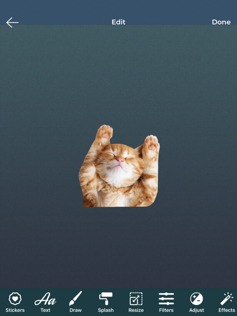
When you open the app, you have two options for choosing your image. You can either “Take a Picture” or “Choose from Library.” For this one, we’ve downloaded a picture of a kitten. Because who doesn’t like kittens? (blushes)
Step #2: Crop it out with the “Free Hand” tool.
In our previous tutorials, we’ve used the “Crop Shape” tool to crop our image. That comes in different shapes and sizes. But for this one, we will specifically use the “Free Hand” tool. Just like in the example below, draw the line as closely as possible to the image you will crop out. This will make your editing easier later. Also, make sure to draw the dotted lines back to the origin.


Step #3: Polish it with the “Eraser” tool.
Now, this is where your patience will be tested. You will use the “Eraser” tool to remove the residues of your image’s previous background. This can be a challenging step, but you can still have fun on this part.
On top of the “Eraser” tool, you can change the “Size” or “Offset” or your “Eraser” tool. The “Size” is pretty much self-explanatory, but what does “Offset” do? That adjusts how far your “Eraser” tool will be from the part you will erase. Cool, right?
Also, not only can you adjust your “Eraser Tool,” but you can also adjust the nearness of the image. This way, you can easily erase the more intricate parts of your image.


Step #4: Save it!
Voila! You’ve successfully achieved that flawless transparent image! From this point on, it’s up to you to add your preferred background or save it as it is. For this one, we just saved it in a PNG format.
You can also select a background from either your photo library, the Cut Paste Photos gallery, or choose a solid color. Pick any hue from our color palette that fits your image. Be creative. Play around with the colors and backgrounds or add more cuts if you want. Have fun!


Selecting the Perfect Photography Background
Now that you’ve achieved the transparent background for your photo, you wouldn’t want to leave it hanging as it is. You have to choose a different background for it. Your background can either make or break your photograph as a whole, so you better choose wisely. Check out these tips on how to select the perfect background for your photographs.
Tip #1: Keep it minimal.
Think of your background as your canvas. You want it to be clean and clutter-free to help your audience focus on the subject. So, choose the ones that don’t feature way too many colors. Or to put a twist on your photo, you can choose a background with some textures. This will add dimension to your photo.
Tip #2: Create the “Visual Breathing Room”
You can create this visual breathing room by adding a negative space in your photo. To do this, include the blank area somewhere in the frame surrounding your subject. This proves to be a visual benefit, as the negative space allows your audience’s eyes to rest.

Tip #3: Take notice of the lines.
You may not notice these at first, but the lamp posts, buildings, or the horizon can make a great impact on your photo. Make sure that the lines from these won’t ruin your overall photo. Place these lines below or under your subject. This will help your subject stand out more.
Tip #4: Break the patterns.
Patterns create a sense of balance and harmony in a photo, that’s why people tend to respond well to them. How will you use this effectively as your background? Just place your subject in the middle of the patterned background to disrupt the sense of symmetry. It’s how you break that sense of order that will catch your audience’s attention.
Tip #5: Enclose them in odd shapes.
You can frame your subject inside distinct shapes like rectangle, square, triangle, or circle. Or if you want to experiment, try incorporating some out-of-the-ordinary shapes to your photos. Not only will this accentuate your image, but it will also make your photo look more visually engaging.

Tip #6: Change your perspective.
Sometimes, you just have to change your perspective to find the right background. If you can’t seem to find the perfect angle, try shifting your subject on a higher or lower spot, or moving it a little bit to your left or the right. In this process, you can actually hide the distracting objects behind your subject just by moving your frame a little.
Tip #7: Create a balance.
There are times where you have no control over the background because of limited resources. When this happens, you have to be creative with what you got. Make good use of the objects, shapes, and lighting in the background. Parts or all of these things will surely help balance your composition and complement your main subject.

Tip #8: Tell a story.
Many think that you have to go to an extravagant place or a scenic view to capture that perfect moment. That’s not true. Sometimes, you just have to stroll in your neighborhood, go to a playground, or just look up at the blue sky. If you’ll just close your eyes and open your heart, you can transform any daily scene into a breathtaking background.
Adjusting Your Aesthetic Background
The aesthetic background is the scenery or another image you put behind your subject photo. Now that you’ve learned the tips above on how to choose the right background, let’s talk about how to adjust it to fit perfectly with your subject. If done right, you can use this effectively for editorial purposes. How to nail it?
1. Blur the background.
Backgrounds are there to support the subject image and not to steal the spotlight. So, to use your aesthetic background effectively, you have to blur it out. This will help fade the unnecessary things captured in the background, and then give your subject a better focus.
2. Use different shades.
It’s a common practice to choose a contrasting color for your background to make your subject image stand out. However, some editors can use the same color and still work it out. How? By using a different shade of the same color. This way, the elements added in the photo would still accentuate the subject.

3. Edit the lighting.
When editing the lights, keep in mind that the aesthetic background also needs to have enough light for good quality. One way to do this right is by using the tone curve to increase the exposure of your photo. Just make sure not to overexpose your image for it may ruin your photo overall.
4. Experiment.
When selecting a background, don’t just settle on one. Be creative. Learn to experiment. Think outside the box. You might be surprised that the color or scene you thought won’t fit your subject will be the perfect background for your photo.
Related Questions
Why can’t I use the other backgrounds from the Cut Paste Photos gallery?
If you’re using the free version, you can choose any background from the “Animals” for free. In order to use the other backgrounds, you will need to go Premium as these are parts of the Premium contents.
Which best fits the photography background: white or black?
The black background may drown your photos while the white background will help make your B&W photos pop. Lighter backgrounds go perfectly with “soft” photography. These are the photos with a lot of out-of-focus blurs, lighter tones, higher key, and muted colors.